Mind Your “p”s, RRs, and NNTs: On Good Statistics Behavior

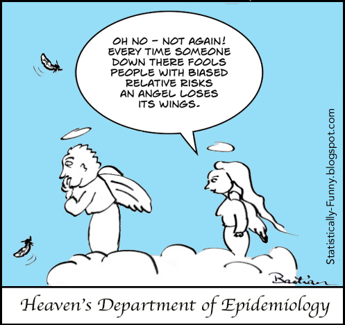
 P is for pandemonium. And a bit of that broke out recently when a psychology journal banned p–values and more, declaring the whole process of significance testing “invalid”.
There’s a good roundup of views about this development from statisticians over at the Royal Statistical Society.
Meanwhile, the American Statistical Association urged the journal’s editors – and anyone else who is concerned – to wait for their upcoming statement on p–values and drawing inferences. Two dozen “distinguished statistical professionals” are at work on it. It’ll be a page turner for sure!
It’s a culture shock for many, that statistical significance does not prove or disprove a hypothesis. Many of us were taught that it does. But it feels kind of silly once you think about it. How could there be a single statistical test that could deliver all that? (If you’re interested in reading more about hypothesis testing, I wrote about it here.)
There’s no doubt that statistical significance is widely misunderstood and misused. But to go from treating it like it’s infallible to banning it totally sure feels extreme. If we stopped using every statistic that’s widely misunderstood, there wouldn’t be much left!
We have a similar situation with relative risk (RR) increases/reductions. It’s a statistic that we encounter from every direction in daily life: “Our Biggest Ever Sale – 50% off storewide!”
I called it risk’s magnifying glass, and being careful when you use or encounter it was my choice for number 1 in a post on keeping risks in perspective.
You need to be careful with how you use and react to RRs, but the RR is an essential statistical tool. For one thing, it’s a key way to calculate an estimate of risk for people.
Let’s use a totally made up example (reduced to just the risk bit of the data). Say your risk of having a heart attack is 0.1% and mine is 10%. If a study showed that by knitting for half an hour a day, people could on average reduce their risk of a heart attack by 50%, for you that would mean your absolute risk (AR) would reduce from 0.1% down by half to 0.05%. But mine could drop by a full 5%.
Or, to put just the AR reduction part of the information into natural frequencies: My risk of having a heart attack would be estimated to be about 10 out of 100 without knitting. With daily knitting, my chances of having a heart attack might go down to about 5 out of 100.
Without using the RR, I could only know the average for people who might not be at all like me. If the studies only included people with a much lower risk than me, and all I heard was their small AR reduction, I would think it wouldn’t make much difference to me.
Yet, just because it can be misused, the RR gets vilified wholesale by many people. Some even advise people to disregard any clinical research that even mentions the relative risk. RRs should be available – just used properly, with enough data there to be able to keep things in perspective.
But here’s the rub: how do we keep perspective? How can we communicate statistical results in a way that people can understand them well enough for them to be helpful?
People want easy, one-size-fits-all answers to do this. That same urgent desire for something simple and quick to grasp is exactly what got us into this mess with p–values. Null hypothesis testing “opened up the arcane domain of statistical calculation” by providing an apparent shortcut to “the truth”.
Which brings me to another statistic that seems simple to many people, too: the NNT. That stands for “number needed to treat”, but you can also use it for other purposes (like number needed to harm, or number needed to screen).
NNTs have been used to communicate results from clinical trials since the late 1980s, although there’s always been a lot of pushback about them, too. You get an NNT by taking the average absolute risk reduction (ARR) (that 5% drop I got in my heart attack risk by knitting) and inverting it (1/ARR).
In this case, that’s 1 divided by 0.05 (5%): an NNT of 20. It’s a way to always get to an expression, “1 in x”. It’s called “number needed to treat” because it’s framed along the lines of, you need to treat 20 people to prevent 1 heart attack. A population perspective on “1 in x” for clinicians.
This means you end up with a collection of “1 in x”s for and as binary outcomes (yes/no answers), but not in continuous form, like blood pressure changes. The “x” changes from outcome to outcome for the same trial(s) – see for example here: the multiple results of possible benefits and harms end up 1 in 14 this, 1 in 43 that, 1 in 28 the other, and so on.
The level of certainty won’t be the same for these different outcomes – different amounts of data usually apply to individual outcomes. That’s usually stripped away, though, when people communicate the NNT. I’ve explained here why explaining the range around any outcome is important. You can do that with confidence intervals around NNTs – indeed, Doug Altman recommended we always do it.
But he also said it’s difficult to explain when the result isn’t statistically significant. I don’t think it’s difficult: I think an intelligible explanation is well nigh impossible. Because the NNT inverts the ARR, instead of describing it directly, one of the ends of the range is infinity (Altman explains why).
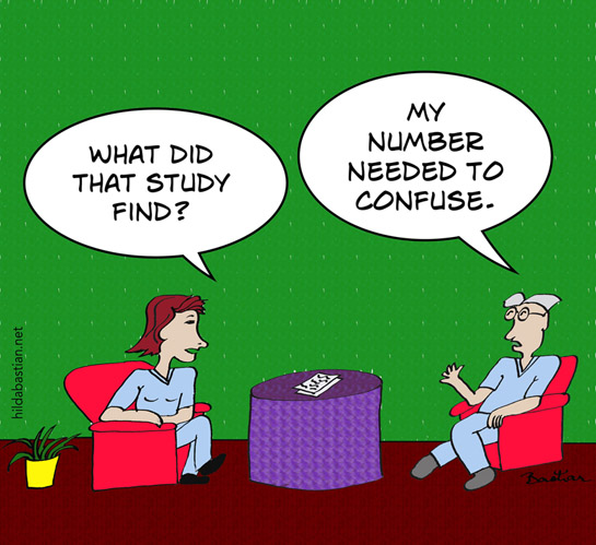
In practice, the NNT usually comes with the impression of randomness – like this graphic. As though health care is always a lottery, and people’s adherence and responses to treatment don’t vary. We’ll come back to this later.
This week, I wrote a short post at MedPage Today calling the NNT an overhyped and confusing statistic that’s not suitable for communicating with patients and consumers. David Newman, from thennt.com, replied there in defense of its value in the wider picture of communicating with patients.
 How did I arrive at my conclusion? Let’s start with what we’re trying to achieve. Let’s assume we’re not trying to persuade or dissuade people from using a treatment because of our own interest or ideological position.
Then we want people to be able to:
- interpret data correctly
- get their situation and choices in perspective
- understand what’s involved to achieve their goal
- make decisions in accordance with their own values.
Is communicating NNTs the best basis for achieving understanding and good perspective?
There are several ways we can go about getting a handle on answers to that with research. We can do comparative studies the same way we do for other interventions. That has particular limitations in communication, though. This goes well beyond the issues of the group of people involved likely being even more unrepresentative than usual. (The participation rates tend to be low, and a high rate of dropouts is common.)
The studies tend to be in very artificial circumstances: the situation tends to be hypothetical, so the same cognitive burdens from stress don’t apply. They tend to focus on exemplar statements with only 1 or 2 numbers – whereas in real life there are multiple pieces of data to juggle, and that in the context of a lot of other information that could be new:
There’s a chance it could affect liver function? What’s that? What could that do to me and what should I do if it happens? Do you mean I take two tablets a day with one meal, or one tablet with two meals? Before or after?…
Then there’s the quality of both the NNT intervention and what it’s compared with. That’s far from uniform. And you don’t want people adding lots of confounders – it doesn’t help us, for example, to consider a simple pictorial rendition of an NNT against a convoluted wordy, number-packed, written description of another statistic.

It’s not easy to make communication interventions comparable. Just because someone is doing a study on communication, you can’t rest assured they’re communication ninjas.
With those provisos in mind, let’s look at the randomized studies of the “1 in x”/NNT mode of presenting risks. For the question of accurately interpreting numbers, I’ve kept “1 in x” and NNT trials as one category.
The wording used in the interventions varies so much between the trials, that they didn’t didn’t end up to me as very distinctly different ways of presenting numbers. People can experience the words differently, though, with the flipped perspective involved. If the “1 in x” trials were excluded, the numbers would drop, but still be substantial.
There’s no good up-to-date systematic review on this. The best review is by Elie Akl and colleagues. They concluded that ARs are better understood than NNTs, with no difference between consumers and health professionals. But their last search for relevant studies was in 2007.
There have now been several different groups of researchers, studying people in different countries, in different ways, and the direction of the findings stays bad news for the NNT/”1 in x”. I found 11 reports of trials among patients or consumers, with 26,879 participants, that have results relevant to understandability. I think it’s strong evidence now: NNTs are harder to understand than other statistics you can use to communicate the results of trials.
Details on the batches of trials I’ll be discussing, including links, are at the end of the post. But here’s a shorter overview. The first batch includes ones I could find that I believe meet the criteria of the Akl review. Except for studies with medical students, which I’ve kept separate. Akl defines them as consumers, but I don’t think they fit together.
I found 6 trials in this first batch, involving 20,419 people (mostly from one study with 16,133 people). None involve the stress of real life decisions (although there are some with clinic patients), and none with more than 2 data cases. The participants predominantly skewed to the well-educated, self-selecting to participate in a communication study. I don’t think we could expect performance as good as this in real life.
In no trial did NNTs get the best result for the questions about interpretation and understanding. In some comparisons, NNTs were no worse than some or all other options, and, rarely, they edged out another statistic. But the NNT is definitely at the bottom of the class, scoring very badly sometimes even on the least challenging multiple choice questions possible.
When people were asked about their preferences, only a small minority gave the NNT first place.
Was there anything else that gave a consistently stellar performance? No. On balance, though, everything else was better than the NNT/”1 in x”.
Batch 2 includes 2 studies with a total of 265 preclinical/medical students. One of the studies conclude that the medical students polarized around the question of whether the NNT was useful. They had already been engaged with the NNT in their professional training.
Batch 3 includes studies that compare NNTs with a time-to-event measure (but from the same clinical trial data). The events were hip fractures and heart attacks. To me, these are relevant to the question of which statistics from trials are best for conveying the chances of benefit to patients, even though they don’t seem to be comparisons of interest for the Akl review.
There were 3 of these studies, with 4,890 people – all in Nordic countries. The results here were more mixed, more complicated, and included little data on accuracy of interpretation. NNT didn’t outperform time-to-event. The only trial that tested interpretation of NNT showed poor understanding.
Batch 4 includes studies that look at whether giving people NNTs of different sizes affects their evaluation of a therapy’s potential benefits. This is relevant to understanding, it seems to me, if it can identify whether people understand the implications of NNTs. We get a repeat study here from batch 3, plus 3 new ones, an extra 2,771 people.
Whether an NNT was low or high didn’t affect decision making on average in 2 of the 3 trials, but people were sensitive to variations in the other statistics. The third trial only compared different NNTs to each other. Then they explained NNT in detail: 24% of people changed their minds about their decisions.
With so many people deeply invested in NNTs, we need an up-to-date systematic review.
What I would like to help me get to the next level on risk statistics, though, probably can’t come from trials on NNTs. Rather, it will come from trials looking at building on ways to improve the statistics that have a head start with people.
And we need to get closer to research that is less rooted in hypothetical decision making. Here’s a trial comparing risk statistics for real. Charlotte Harmsen and colleagues published it in 2014. It was an arduous trial for them to pull off, by the looks of it. Respect!
They compared AR and a time-to-event outcome, prolongation of life (time-to-death from heart disease): 25% filled a statin prescription when informed by AR (the simpler-to-understand inverse of the NNT) – and only 5.4% of the others.
Gerd Gigerenzer, as well as Gary Brase, make persuasive cases that using frequencies is “ecologically rational” – that, in effect, this is closer to how our minds work with information. They go further with some evidence to back them up, to suggest that we can improve people’s ability to accurately interpret statistics by using frequencies.
Stephen Senn argues that we need not NNTs, but to use modeling if we want to generate robust data on clinical relevance from trials. Exploring that seems worthwhile to me. As does addressing specific issues such as how we can communicate low probability events in ways we’ve only touched on.
We also urgently need fundamental qualitative and social science work – especially to better understand what might be harmful. There are clues already that NNTs in particular might be misleading. To go so far in communicating randomness, that people think all treatments are just a lottery because we obscure patient variance, has the potential for harm.
On being the “1” who experiences harm: “You could always tend to say, ‘It’s not going to be me’,” said a woman in a qualitative study by Marilyn Schapira and colleagues. Ensuring we communicate variance – at least through confidence interval ranges – may help to counteract people thinking it doesn’t apply to them, because they’re uniquely invulnerable, at lower risk of harm than the average person.
A qualitative study with clinicians by Robert Froud and colleagues signals to me reasons to be a little concerned about NNTs in practice. If clinicians like it because they think it’s straightforward and strip it completely of complexity, then we may have a problem: “[NNT]: far more effective than bloomin’ confidence intervals and all the rest of it!”
Perhaps most of all, we need more people to stop encouraging the illusion that communicating statistics to patients is simple.
[Update, 3 June 2017]: Diogo Mendes and colleagues published a review of articles using NNTs and concluded that NNTs are frequently incompletely and mis-reported, which can make them uninterpretable or misleading – and 29% don’t follow the basic recommendations for calculation.
~~~~
The NNT was developed in part to get around the complexity of understanding of the odds ratio (OR). I tackle this and the paternalism of manipulating with statistics here.
Want to learn more about understanding risks? There’s some evidence this book by Steven Woloshin, Lisa Schwartz, and Gilbert Welch is effective: Know Your Chances.
Recommended reviews/overviews:
The cartoons are my own (CC-NC license). (More at Statistically Funny.)
Declaration of interests: My current areas of research do not include evaluating the merits of risk communication. My most recent publication in that field was published in 2013. I used to be the Coordinating Editor of the Cochrane group responsible for the Akl review, but that was well before this review came into being. I have co-authored with Akl and other authors of that review, as well as having undertaken a systematic review in risk communication many years ago with Adrian Edwards. Steven Woloshin and Lisa Schwartz are current colleagues of mine, as I’m a faculty member of NIH Medicine in the Media, which they organize. Although I peer review in this field, I was not involved with any of the trials in this post.
I have commented on the Akl review at PubMed Commons.
The batches of studies I discussed:
Batch 1, with key findings related to interpretation/understanding of risk:
- Grimes (1999): 633 women, USA, not only native English speakers. Compared a rate per 1,000 with a “1 in x”. 73% correctly chose which was higher when it was the rate; 56% when it was “1 in x“.
- Sheridan (2003): 357 clinic patients, USA. Compared RR, AR, NNT, and a combination. Choose which of 2 treatments provides more benefit: RR 60% correct; AR 42%; NNT 30%. Their conclusion: “NNT is often misinterpreted by patients and should not be used alone to communicate risk to patients”.
- Berry (2006): 268 women, UK. For adverse effects of two drugs, compared RR, AR, “NNT,” with and without baseline risk information provided. Participants’ ratings of ease of judging risk. No difference when baseline risk provided. Without baseline risk, no difference between RR and “NNT”, but AR better than both. AR mean rating 2.22 (SD 1.28); “NNT” 1.85 (1.10).
- Cuite (2008): 16,133 people, USA. Tested whether people could make sense of operations with comparisons (which of 2 is bigger?), trade-offs, adding, halving, tripling, and understanding sequence (10% of people benefited, 3% of those…). Compared frequency, percentage, “1 in x“. Incorrect answers outnumbered “don’t know” answers. Overall accuracy rates: frequency 55%, percentages 55%, “1 in x” 45%. Much higher for the comparison question: 81% mean, without major differences.
- Carling (2009): 2,978 people, mostly USA and Norway. Comparisons of natural frequency, percentages, RR, AR, NNT, TNT (tablets needed to take). Accuracy (inadequate data reported): accuracy between 65% and 75%: 75% was for natural frequency. (Most preferred presentation: natural frequency (31%), RR (30%), percentages (20%), NNT (10%), AR (5%), TNT (3%).)
- Selinger (2013): 50 clinic patients, Australia. Compared RR, AR, NNT, and a graphical presentation. Participants’ ratings of understandability: RR (94%), AR (88%), graphic (74%), NNT (48%). (Most preferred presentation: RR (48%), AR (20%), NNT (4%), graphic (28%).)
Batch 2 includes studies in medical students, who are counted as lay people by the Akl review. Two studies with 265 students:
- Sheridan (2002): 62 medical students, USA. Given baseline risk information for a hypothetical disease, plus RR, AR, NNT, or combination. Correct interpretation: 25% for NNT compared with 75% for the non-NNT.
- Chao (2003), also reported by Studts (2005): 203 pre-clinical medical students, USA. RR, AR, NNT, absolute survival benefit. Round 1 given 1; round 2 given all 4. Non-quantitative data: absolute survival benefit was the easiest to understand. Quantitative data: The NNT met with a response they categorize as “polarized”. (NNT rated as most helpful by 22-25%, in pairwise comparison rated more helpful than AR and RR.)
Batch 3 includes studies that compare NNTs for one outcome with a completely different outcome (but from the same clinical trial data). Three studies, 4,890 people:
- Christensen (2003): 967 general population sample, Denmark. Compared NNT with a time-to-event measure (how long till hip fracture). Assumed the time-to-hip-fracture is virtually universally understandable. Multiple choice question for accurate interpretation of NNT: 18% answered correctly.
- Halvorsen (2007): 2,754 people, Norway. Compared NNT (22 words with 2 numbers), time-to-event measure (how long till heart attack) – version 1 with 44 words and 2 numbers, version 2 with 56 words and 4 numbers. No difference in participants’ ratings of understanding.
- Stovring (2008): 1,169 general population sample, Denmark. Compared hypothetical acceptance of a treatment in 2 rounds. Round 1 was AR, RR, NNT, or time-to-event measure (how long till heart attack); round 2 was after seeing all with a graphic explanation. No statistically significant difference in concordance.
Batch 4 includes studies that look at whether giving people NNTs of different sizes affects their (hypothetical) decision making. We get a repeat study here from batch 3, plus 3 new ones, an extra 2,771 people:
- Kristiansen (2002): 675 general population sample, Denmark. The magnitude of NNT was either 10, 25, 50, 100, 200, or 400. Around 80% of people would be willing to take the hypothetical drug discussed, regardless of the level of the NNT.
- Christensen (2003) (repeat appearance): 967 general population sample, Denmark. Compared NNT with a time-to-event measure (how long till hip fracture). This included NNTs of 10, 50, 100, or 400, and different duration to hip fracture of 1 month, 6 months, 1 year, or 4 years. Differences in the time measure changed people’s opinions; differences in NNTs did not.
- Halvorsen (2005): 1,201 general population sample, Norway. Magnitude of NNTs of 50, 100, 200, 400, 800, 1,600. Other variants included disease, treatment costs. Participants decided whether or not they would hypothetically consent to a therapy before and after explanation of the NNT. Comprehension of NNT was not assessed. Proportions hypothetically consenting ranged from 76% when the NNT was to 67% when it was 1,600. 24% changed their decision after the NNT was explained in detail.
- Gyrd-Hansen (2011): 895 people from the general population, Denmark. AR, RR, NNT or time-to-event measure (death of a heart attack). Participants were sensitive to changes in scale of AR, RR, and time-to-event, but not of the NNT.
* The thoughts Hilda Bastian expresses here at Absolutely Maybe are personal, and do not necessarily reflect the views of the National Institutes of Health or the U.S. Department of Health and Human Services.
Hilda–Nice blog post. The problem is rolling values and preferences up into statistical averages. When that is done, it takes decision making out of the hands of those whose lives are impacted. It is much better to communicate risk and to communicate benefit in ways that allow patients to make meaningful decisions when decisions involve trade-offs. For a healthy person, the acceptable amount of risk and the odds of achieving any benefit may be very different from someone whose quality of life is diminished significantly by disease. Beyond this, my risk tolerance and yours may be different even when our circumstances are similar. No “average” can or should take the place of these types of assessments.
Thanks, Lorraine. Yes, people’s risk tolerance is extraordinarily different. So too is people’s interest in taking statistical information into account at all. It’s context-specific, as well as individual-specific. There are times I’d do a systematic review level scouring for information on a personal health question – and times all I’d care about is getting by with the minimum amount of effort.
Thank you for highlighting this issue of ‘P’ values. Despite what John Ioannidis has published, we never seem to try to estimate the probability of replication. So how about this:
If the null hypothesis (e.g. of zero difference between two means) were true, then the probability of getting the observed result of something more extreme by repeating the study is ‘P’ (e.g. 0.05). This is the meaning of a ‘P’ value. However, the converse is that if the observed result were true, then the probability of getting the null hypothesis or something more extreme (e.g. a difference of zero or something more extreme) by repeating the study is also 0.05. This also means that if we repeated a large number of different hypothetical studies about different topics but with the same mean and distribution as ours using the same number of observations, the probability of ‘non-replication’ by getting a result such as a difference of zero or something less extreme is also 0.05. This means that the probability of replication of something less extreme than zero difference will be 0.95 (NOT the probability that the ‘TRUE’ result will be less extreme than a zero difference).
However, a replicated difference of barely more than zero is not much in the way of replication. If we expect a difference more like the observed result, then the probability of replication based on the data only may be much less than 0.95 and the probability of non-replication will be much more than 0.05. But this is only based on the ‘numbers’ and values observed. We also have to read the paper carefully for the possibility of hidden biases, the results of other similar studies, the effect of differences in subjects studied, etc. to estimate the probability of replication in some other study centre. The underlying reasoning process is discussed in more detail elsewhere (see http://blog.oup.com/2013/09/medical-diagnosis-reasoning-probable-elimination/0).
Thanks, Huw. I think your point about reading the paper carefully as well as understanding the numbers is key. And the idea that the p value is “the bottom line” and no further effort is required has caused a lot of problems.
The reality for studies in people is that there isn’t going to be another group of people exactly the same again. Nor is a clinician’s group of patients likely to have exactly the same distribution of characteristics and variance of outcomes as the people in a study. For me, that’s the one of the frustrations when people take study data as too literally predictive just because a result was statistically significant. Which is part of what they are doing with NNTs when they say “If I prescribe this drug to 23 of my patients…”.
Wow! I can”t help but say you have tried, was recently reading an article about p-values and I realized there is more to significance levels, determining RR and more. Thanks for this nice piece as this is an eye-opener for me.