Why Don’t We Do More Visualizations of Methods?

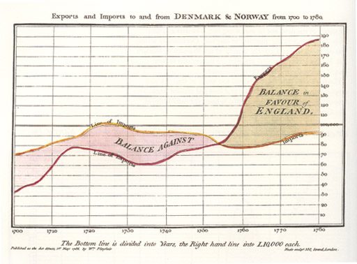
When engineer and political economist William Playfair started designing graphical representations of data in the 18th century, he was trying, he said, “to clear up my own ideas on the subject”. Many of us do that ourselves, don’t we, when we’re planning a research project, mapping out methods. But unlike visualizations of results, or diagrams of conceptual or technical processes, with a few exceptions, graphical and process representations of methods don’t make their way into papers. I think that’s a lost opportunity.
Data visualization worked so well for Playfair that he became a passionate advocate of graphics to help readers cope with information overload, get past non-specialists’ limited grasp of statistics, and communicate quickly.
Over time he developed theories about data visualization:
Information, that is imperfectly acquired, is generally as imperfectly retained; and a man who has carefully investigated a printed table, finds, when done, that he has only a very faint and partial idea of what he has read; and that like a figure imprinted on sand, is soon totally erased and defaced.
It’s not only a study’s results we need to get a clear handle on though, is it? We need a good grasp of the strengths and weaknesses of a study’s methods before we place any weight on results at all. It’s just tradition and habit, I think, that ossified methods as words only, locking them out of the drama and creativity of visualization. There have been some breakthroughs, though, in the fields I read and work in most.
Getting his own mind clear on a subject is what led David Moher to develop another kind of chart – one that starts to represent some methodology visually. Moher is a Canadian epidemiologist. He was in the habit of sketching out what happened to participants in clinical trials when he tried to make sense of the publications reporting them.
Moher has dyslexia, and he used to think that was why he struggled to work out exactly who did what to who. But when he would try to fill in the blanks in his mapping, he realized the problem wasn’t him: the vital data he needed to get a good picture was typically scattered, obscure, or missing.
Moher and 10 other people gathered in Chicago in September 1995 to consolidate standardized reporting for clinical trials – the standards that became the CONSORT guidelines. And his flowchart for wrangling and visualizing participant flow was incorporated. It illustrates a core part of clinical trial methodology, quantifying results for each step. It’s results reporting, but it’s tied to the methods that shaped the study, making those steps visible.
This standardized diagram makes deciphering what happened in a clinical trial so much easier! Here’s a good example from a recent proof-of-concept trial:
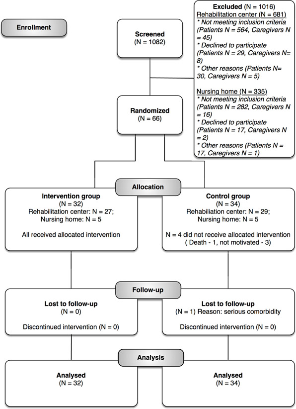
There is some evidence suggesting that journals adopting the CONSORT standard might lead to improved data on participant flow in clinical trials. But there’s more to it than that. At least if you’re a relatively frequent reader of trials, I think it makes it far easier to get your head around what happened in a trial. And that’s a big deal.
I haven’t been an author of a clinical trial, but I have used flowcharts for methods. The flowchart for methods is one of the things that systematic reviews in biomedicine learned from their trial children. And my experience of them is that they add a level of discipline that has other benefits.
The CONSORT equivalent for systematic reviews in biomedicine was PRISMA. It maps out the flow of information through the study, and I’ve used the approach for other work too.
When you create a flowchart early on, with readers in mind, you start to see things you have missed. There is something fundamentally valuable in stringently linking methods to results in this particular form. As you try to agree on the kind of sharpened, precise wording you need to communicate certain steps, you discover that you and your colleagues have been interpreting, and thus implementing, some things differently. And of course, by adding in a step that puts numbers to steps, you occasionally find a data error that may otherwise have escaped.
I’m sure there must be other great examples of visualizing methods in other fields. There’s a nice example of visualizing a sampling process and research scope by Namkyu Chun and Julia Valle-Noronha in fashion research (page 19 here). Conference posters are a great place to experiment with diagrammatic representations, and there must be lots of great examples. Some graphical abstracts include at least snippets of methods, along with the data, although that is more down the infographic, than visualization, line.
Johannes Wheeldon and Mauri Ahlberg’s book aims to teach social scientists to use visual tools in doing research – the kind of process you see on whiteboards in rooms of brainstorming scientists all over the place. This could all be inspiration for creativity in breaking down this “fourth wall” in science communication.
The methodology is the core science part of research, isn’t it? It’s critical for readers to be able to judge the internal validity and the relevance of research findings. Let’s face it, it’s not worth paying any attention at all to most research findings, and understanding the methods often lets you know not to bother reading further.
Yet despite their central importance, methods are the poor cousins of science communication. Some journals even – shudder! – bury them in the supplementary information. I think we should do more to put them in the spotlight, where they deserve to be. Giving them figures could give them a chance for attention alongside the power of results in a graph.

~~~~
Here are some standardized diagrams for methods, and mapping to methods – please let me know in the comments or on Twitter (@hildabast) if you know of others:
- CONSORT for randomized trials
- PRISMA and ROSES for systematic reviews
- ROSES for systematic evidence maps
My thanks to David Moher for generously sharing his story of how the CONSORT flow diagram came to be.
Disclosure: I was one of the co-authors of PRISMA for abstracts.
The cartoons are my own (CC BY-NC-ND license). (More cartoons at Statistically Funny and on Tumblr.)
William Playfair’s chart comes from his 1786 book, The Commercial and Political Atlas, via Wikimedia Commons (copyright expired).
The CONSORT flow figure comes from the CARE4STROKE trial by Judith D.M. Vloothuis and colleagues, 2019 (CC-BY license).