There are several reasons to buy Helen Pearson’s excellent new book, Beyond Belief: How Evidence Shows What Really Works—whether you want to…
5 Tips For Understanding Network Meta-Analysis

Network meta-analysis (NMA) is an extension of meta-analysis, combining trial evidence for more than 2 treatments or other interventions. This type of study could also be called a multiple-treatment comparison or meta-analysis, or an indirect and mixed-treatment comparison. A quick and dirty search of PubMed indicates there could be 2,000 or more published every year now.
A network meta-analysis estimates the relative effects of all the treatments at once. Thus, it can give you an idea which treatments performed best – and worst – on different outcomes. When there is too little evidence testing treatments directly against each other in head-to-head randomized trials, this kind of meta-analysis can also provide more precise estimates of the relative effects of each by drawing on an extended network of connected trials. And it can provide an estimate of the relative effect of treatments that have never actually gone head-to-head in a trial.
The steps for this type of statistical model include standard meta-analyses, with additional steps in assembling and analyzing the evidence network. That comes with another set of jargon and data visualizations on top of those for standard meta-analyses. I’ve got an earlier 5 tips post on understanding the data in standard meta-analyses: This post picks up from there.
1. Both direct and indirect evidence from a network of trials get meta-analyzed, separately and together.
For network meta-analyses, eligible trials are gathered and assessed following a systematic review protocol. Direct evidence is meta-analyzed first, and it should be reported separately as well. Direct evidence comes from randomized trials which test treatments against each other and/or against placebo – for example, a drug is tested against another drug or placebo. Each analysis of an outcome of testing 2 alternatives is called a pairwise comparison.
Pairwise meta-analyses are done for each set of direct evidence in the group of trials. That’s the critical basis for evidence for the whole analysis.
A set of trials of multiple interventions forms a network of both direct and indirect connections like this:
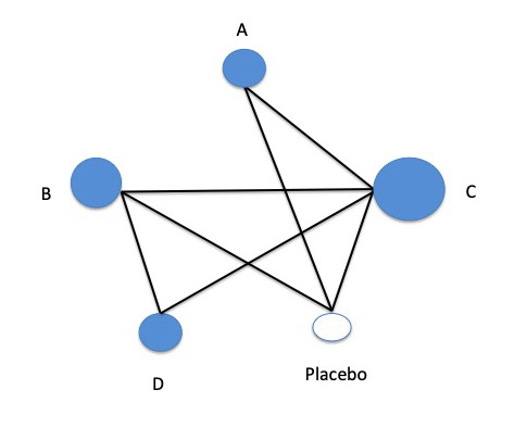
In this example, drug A hasn’t been in a head-to-head trial with drug B, so there is no direct evidence between them. However, both of the drugs have been in placebo-controlled trials, and they have each been tested against drug C, too. One of them, drug B, has also been tested against drug D. In addition, drug C has been tested against placebo, and against drug D. Only drug D, the newest drug in this group, hasn’t been tested against placebo – and only drug C has been tested against all the others.
Indirect evidence can come from estimating effects in the trials against comparators the treatments have in common. In this trial network example, indirect evidence for how drug A might perform relative to drug B comes from 2 common comparators of those drugs in trials – against placebo and against drug C.
This is done by calculating the relative performance of treatments against the connected evidence, instead of against each other. For example, one drug might have shown a greater benefit against placebo than all the others did, while another might have had almost as much benefit with fewer adverse effects.
The final network meta-analyses combine all the direct and indirect evidence to calculate network effects that sum up how the treatments compare to each other.
2. The trials included in the network should be so similar that direct and indirect evidence are consistent.
The direct evidence provides the only randomized clinical data in the network. The reliability of the indirect evidence therefore depends on the trials being similar enough for the treatments to be responsible for differences in results. If trials in participants with severe disease are mixed with trials in people with mild disease, for example, then the validity of indirect evidence drawing on incompatible comparisons is threatened.
This assumed similarity is called transitivity, and it’s a key principle underpinning network meta-analysis. For results to be valid across the connections in the network, the comparison groups for a treatment need to theoretically be like arms in the same whopper trial – or regarded as “jointly randomizable” in NMA jargon.
In theory, important factors that could bias indirect evidence are detected before including a trial in the network. In practice, the report of every trial doesn’t necessarily reveal all the information you need to be sure. So to be confident that transitivity holds up, researchers have to be vigilant for signs it might not.
A key source of confidence is consistency of results from the varied sources of evidence in the network. To be precise about what’s meant by statistical consistency in the NMA context, it’s called coherence.
One way of checking for coherence is to examine the results for the treatments which have both direct and indirect evidence in the network. That’s called a closed loop. Let’s look at the same network diagram again:
In this theoretical network, drug B is a closed loop: There is direct evidence for it versus drug C from a head-to-head trial – and there are sources of indirect evidence, too, because B and C have common comparators (drug D and placebo). Testing for coherence between these results helps assess how confident we can be about these trials being combined.
3. Thickened lines and dots in the network diagram show where most of the evidence lies.
In a standard pairwise meta-analysis, the diagram commonly used to show results is called a forest plot. In those, each trial gets a separate horizontal line. However in a network meta-analysis, each line in a network diagram represents a direct comparison made within a trial. So a single trial can get more than one line, if it includes arms for 2 drugs and placebo, for example.
When the same comparison has been done in more than one trial, the line symbolizing the comparison in the graph will swell with each addition. That means that comparisons tested more frequently than others stand out, looking much more solid than the others. In the theoretical network from earlier in this post, if the only comparison available in more than one trial was between drugs B and C, it could look like this:
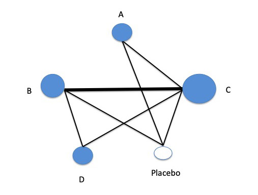
It’s not just the lines that get bigger with each additional trial in a comparison. The circular nodes that symbolize the treatments increase, too, representing the number of participants in the trials.
Sometimes colors are used to highlight additional features of the lines – such as how high the risk of bias is in comparisons.
A report of a network meta-analysis should show you the combined results of each meta-analysis of direct, pairwise comparisons. This might be shown in a diagram in forest plot style, where each horizontal line is the estimate for a treatment. The data might also be in a table.
4. Treatments can be ranked, but you need to read the fine print to avoid a wrong impression.
The evidence in a network meta-analysis might be strong enough to reliably rank treatments from most to least effective for particular outcomes. This is done by calculating the probability of a treatment being in each position in the ranking. For example, the probability that a placebo gets the first position – most effective treatment – would be 0.
This can be very misleading, though, if the ranking is too simplistic – if, for example, treatments with only small, low-quality trials rank more highly because they have large effects, even though those effects are actually very uncertain. So you have to look closely at the fine print for a ranking.
It’s also critical to keep in mind that a treatment might rank highly for one outcome, but not at all well for another. If researchers have singled out a treatment as the most highly ranked overall, it might not be based on the outcomes you are most concerned about.
This brings us to another NMA-specific data visualization, called a rankogram (“rank-o-gram”). That’s not a single diagram. It’s a group of standard X and Y axis charts, plotting probability on the vertical axis, with ranking on the horizontal axis – if you were doing that with the theoretical network example in this post, you could rank the 4 treatments plus placebo from 1 to 5.
You can see an example of a real rankogram here. In that NMA, the researchers compared 9 surgical treatments for women with stress urinary incontinence. The rankogram in this case is for which treatments result in the highest number of women cured or improved. There is a separate chart for each of the 9 treatments, with each chart showing the probability of that treatment ranking from 1st to 9th.
In that NMA of surgical treatments, there were 175 trials in the systematic review – and 120 of them went into the network meta-analysis. Overall, though, the quality of the evidence was low, and inadequate for the risk of harm. It’s a complex picture, but it would be even harder to make sense of this without network meta-analysis, when there are so many choices.
5. The network is a clue to biases introduced into the evidence by what treatments get the most and best trials.
This brings us to the point I’m making in the cartoon for this post:
The picture that a network reveals is called the geometry of the evidence. This concept comes from the way diversity is measured in ecology. It shows when comparisons might be preferred, and when some are avoided. In my cartoon, the manufacturers of 2 drugs are preferring to compare their drugs to ones that are sure to put theirs in a good light.
The PRISMA guidelines for reporting details of NMAs include this critical feature. Network meta-analyses, the guidelines say, should make the geometry of the evidence clear to readers, and discuss critical gaps in the evidence and “potential biases reflected by the network structure.”
In an ideal situation, every treatment option currently available would have been very well tested in excellent trials, providing us with very reliable answers to our questions. For all sorts of reasons, though, research isn’t that systematic. It’s critical to keep the quality of the evidence in mind. And the network itself can reveal a lot about biases in the evidence base.
More sources on network meta-analysis:
- “A clinician’s guide to network meta-analysis” by Mark R. Phillips and colleagues.
- The PRISMA Statement for Network Meta-Analysis, showing what should be reported.
- The chapter on NMA in the Cochrane Handbook.
- A 10-minute video introduction to basics and technicalities of NMA by Georgia Salanti at Cochrane.
My series of meta-analysis explainers

~~~~
The cartoons are my own (CC BY-NC-ND license). (More cartoons at Statistically Funny.)